Croatia Vacation is a UK focused travel website dedicated to helping visitors discover Croatia and plan their holidays. For the brand identity, Fiksie created a logo design that needed to communicate travel, sunshine and the Croatian coast while remaining clear and recognisable across digital platforms.
The visual identity was developed with the wider travel experience in mind. Rather than relying on obvious tourism symbols, we focused on a strong colour combination and clean typography that could give the brand a distinctive presence.
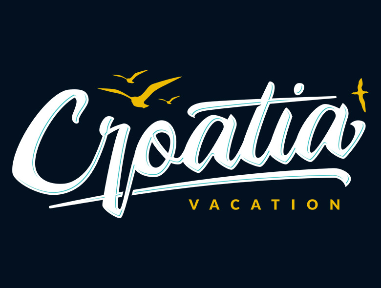
Colour Inspired by the Croatian Coast
Colour plays an important role in travel branding because it can communicate a destination before a visitor has read a single word. For the Croatia Vacation logo, we selected a palette that reflects the visual character of Croatia while giving the identity a polished and contemporary appearance.
The foundation of the logo is the deep navy #031020. This is more than simply a dark background. In colour psychology, dark blue is commonly associated with trust, stability, confidence and professionalism. Those qualities are valuable for a travel brand, where visitors need to feel that they are dealing with a reliable source of information before they begin planning a holiday.
For Croatia Vacation, the connection with the sea is equally important. Croatia is strongly associated with the Adriatic, and the dark blue creates an immediate relationship with water and the coastline. At the same time, the depth of the colour avoids the more obvious bright blue often used in travel branding. This gives the logo a more refined and premium character.
The main lettering uses #ffffff, creating a strong contrast against the navy background. White is associated with clarity, simplicity and openness, which makes it particularly effective for a travel identity. It keeps the logo easy to read and prevents the darker background from making the overall composition feel too heavy.
From a design perspective, the white lettering also creates visual breathing room. Rather than filling the logo with several competing colours, the white allows the brand name to remain the primary point of attention while the accent colours provide personality around it.
The first accent colour is the warm golden yellow #f1b807. This is where the palette introduces the feeling of a Croatian holiday. Yellow and gold naturally suggest sunshine, warmth, summer and optimism. These associations are especially relevant to a travel brand promoting Croatia, where much of the visitor experience is connected with sunny weather, coastal landscapes and outdoor experiences.
The particular role of the yellow is to introduce warmth into an otherwise cool palette. Navy and turquoise both sit within the cooler side of the colour spectrum, so the golden accent creates contrast and prevents the identity from becoming visually cold. It also gives the logo a small amount of energy without requiring complex graphic elements.
The second accent is the lighter turquoise #4bc4bf. Turquoise is particularly effective for a coastal travel identity because it sits visually between blue and green. It can suggest clear shallow water, swimming, beaches and the brighter tones found around the Adriatic coastline.
This colour also works well alongside the deep navy. The two blues are related, but their difference in brightness creates depth within the palette. The navy provides stability and structure, while turquoise introduces freshness and movement. This gives the identity a useful balance between professionalism and the relaxed feeling associated with holidays.
The turquoise is also used in lighter details within the logo, where it can soften the overall composition and create visual interest without competing with the white primary lettering. This is important because a travel brand should feel inviting, but it still needs to maintain a clear and professional identity.
The relationship between all four colours is what makes the palette work. #031020 establishes depth and trust. #ffffff provides clarity and contrast. #f1b807 introduces sunlight and warmth. #4bc4bf brings in the freshness of the Adriatic.
Rather than assigning every colour equal visual importance, the palette uses hierarchy. The navy and white establish the core identity, while yellow and turquoise act as supporting accents. This makes the logo easier to recognise and gives the brand enough flexibility to work across different digital applications.
For a travel brand, this balance is particularly useful. A palette made entirely from bright holiday colours could easily become generic or overly playful. By combining those familiar travel associations with a deep, sophisticated navy, the Croatia Vacation logo can communicate both holiday inspiration and trustworthiness.
The result is a colour system that feels connected to Croatia without depending on literal illustrations of beaches, flags or landmarks. It communicates the destination through atmosphere instead. The viewer sees the dark blue of the sea, the brightness of sunlight and the clear turquoise of coastal water, creating an immediate visual association with travel and the Croatian coast.
That was the intention behind the logo design: to create something simple enough to remain recognisable, but with enough colour character to make the Croatia Vacation brand feel distinctive within the competitive travel market.
Logo Design for Digital Use
The logo design was created primarily for a digital environment, so clarity and scalability were important considerations. It needed to work effectively within the website header while retaining its character at smaller sizes and across different screen dimensions.
The combination of dark navy, white, gold and turquoise gives the identity enough contrast to remain immediately recognisable while creating a visual connection with the destination itself.
This approach also formed part of the broader logo web design thinking behind the project. The identity was not designed in isolation from the website. Its colours and proportions were considered in relation to the navigation, content and overall interface so that the brand feels consistent throughout the visitor journey.
A Logo Built for a Long Term Travel Brand
Good logo design should not depend on short lived visual trends. For Croatia Vacation, Fiksie created an identity that could remain relevant as the website and its content continue to develop.
The wider website was built with performance, SEO and security in mind. It uses programmatic Schema.org markup for destination content and was structured to remain easy to update and maintain. The website has also remained stable over many years without major issues.
The logo provides the visual starting point for that experience: simple, recognisable and closely connected to the colours and atmosphere people associate with a holiday in Croatia.
